Cease and Desist from Multnomah Athletic Club Inspires New Look from Migration Brewing Co.
 Migration Brewing Co.’s pub at NE 28th and Glisan Street in Portland is a popular summer hangout, especially during the summer month when thirsty punters can enjoy a few delicious brews in the sunny beer garden on the brewpub’s north side. The brewpub’s winged M logo has become a beacon for the malty goodness within. But recently this logo has been forced to go by the wayside after Multnomah Athletic Club (MAC) filed a cease and desist order on the small business last year.
Instead of battling the tumultuous uphill fight that so many must do to keep their brand imagery, Migration used the opportunity to spin the litigation into a dynamic new look for the company, avoiding any negativity or costly court battles.
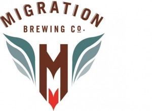
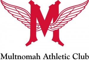
Is there really that much similarity between the two? You decide:
Here’s the details from a release sent out today by the folks at Migration Brewing:
Migration is excited to share the evolution of our company’s new logo. Why is Migration changing their logo? Simply said, we have chosen to evolve the logo due to a cease and desist filed by the Multnomah Athletic Club (MAC) last summer. Under the threat of being sued over this issue, we decided that we would prefer to spend our time making great beer rather than getting caught up in a potentially costly and time consuming lawsuit.
We are excited about the rollout of our new look and have worked hard to produce new tap handles, merchandise and marketing materials that better communicate our brand and company story. We appreciate the loyal support shown by our friends, customers and
community and we look forward to keep following our passion of making great beer for great people. So please join us in raising a glass to our evolution Saturday, August 11th, 2012 with specialty beers, giveaways, and a celebration focusing on the new logo rollout.


Sounds like someone at the MAC has way too much time on thier hands. Also do they own the rights to wings? Why not sue the Red Wings, or the tv show Wings, or hell Aerosmith has a winged logo – why not sue Steven Tyler? All that to say – the MAC is way out of line and at the next Timbers match I will happily salute them with the bird for such douche move.
After sitting on both sides of the back and forth letter writing of these trademark skirmishes, I’ve learned only two things: 1) Business owners and stakeholders love their brands and want to protect them AND 2) Quality of work products and the integrity of the people who produce them are infinitely more important than any graphic element of a brand. Cheers to MAC for taking action to protect their brand as they saw fit. But most importantly, you should raise a glass to Migration for not caring a bit. It’s all about the beer.
Bolt, stil touchy about that angel wing tattoo I see.
Well, I do prefer the new one.
“Where the respective marks or products or services are not identical, similarity will generally be assessed by reference to whether there is a likelihood of confusion that consumers will believe the products or services originated from the trademark owner.”
Athletic club vs. beer…where’s the confusion!?
The MAC logo looks like a M using a pair of wings to towel off with after a sweaty shower.
To each their own opinion. Mine is that I will never consider spending a dime at MAC and will do my best to convince my friends to avoid them as well. I feel that only through naming and shaming will we ever see this sort of business mentality go away and be replaced by common sense.
Remember when Sam Adams Inc sued our mayor claiming that they owned his name. He had two election websites such as samadamsformayor.com with no mention of beer. Sadly, there are endless examples.
Congrats to Migration for taking the high road of integrity.
The Multnomah Athletic Club (MAC) has nothing to do with beer. Competition? I think not. Silly lawyers.
I don’t see much similarity. But I do see how MAC might not want Migration to use the old logo so that they could steal it. MAC logo is way out of date, and I wouldn’t be surprised if they updated their look to something similar to old Migration logo. However, I would suggest MAC use the capital M along with a giant bag of vinegar.
Exactly the sort of shenanigans I would expect from a country club without a golf course…
I noticed the similarity of the logos last spring. Migration and the MAC aren’t remotely in the same business, but I figured this might happen. The only reason Migration caved is they simply do not have the financial resources the go to court. The MAC has deep pockets. Best change your branding and live to fight another day. They aren’t going to miss the wings.
I guess it’s not just the members of MAC that are douches…
I’m a member of MAC. I don’t have a strong opinion on this , but I would say Migration made a good move backing off of a lawsuit. But a covered wagon pulled by oxen might have added a nice touch to the logo.
Justin and Portland Guy, I’m a member of the MAC and I am not a douche! Just a normal Oregon girl who likes to drink good beer. I never even heard about this until now. The members had nothing to do with this.