In Time For Summer, Reuben’s Brews Unveils a Brand Refresh
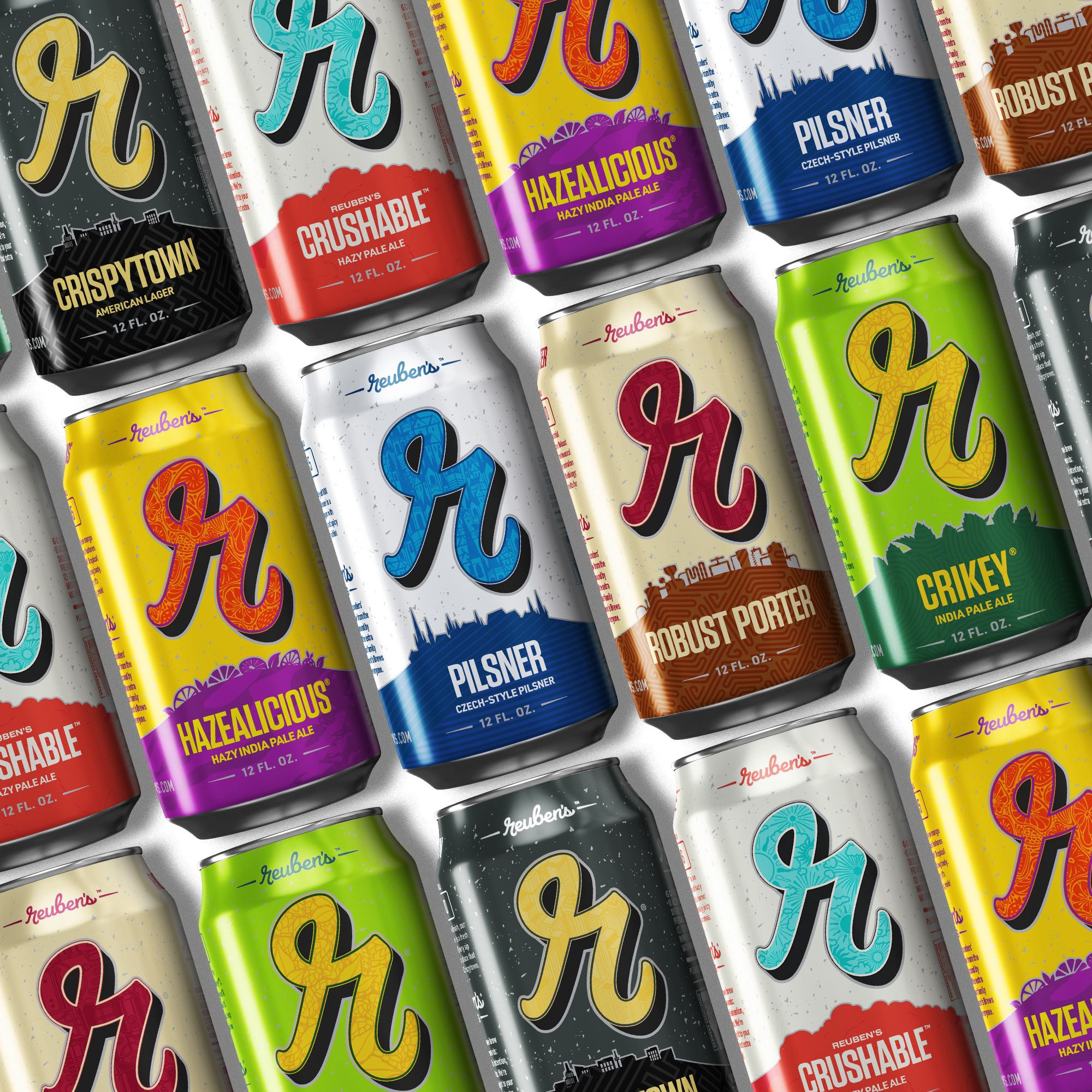
Now in its 12th year, Seattle, Washington based Reuben’s Brews unveils a refreshed packaging with new can artwork while continuing to focus on the brand’s well established lower case cursive ‘r’. This new look packaging will also include new 12 packs of select offerings from the Ballard brewer!
The Reuben’s refresh is only taking place on the packaging as the beer itself has not changed. According to the brewery, the brand’s lower case cursive ‘r’ has been subtly enhanced to offer a window into each beer’s story, and the addition of a new silhouette invites customers to explore the depth behind every can design.
“Just as we all update our wardrobes over time but are the same people underneath, our cans have updated their look but are still the same great tasting beers at heart,” said Adam Robbings, co-founder at Reuben’s Brews, in a press release. “We spend every week making our beers just that little bit better, working to add delight to your day. It’s been a really fun project to brighten up our cans and better share each beer’s story!”
In creating its new branding, Reuben’s Brews once again reached out to Top Hat, the creative agency that the brewery worked with on its last branding updates that took place in 2019. With this new update, the essence of the current color schemes has been maintained, while boldly highlighting the Reuben’s cursive “r” on each can. This change reflects a natural progression of the cans over time.
In addition to the can upgrade, the refresh includes the introduction of new 12-pack boxes, merchandise, and Point-of-Sale materials—these stories will bring life to each of the beers. These changes will begin to roll out across the Pacific Northwest in late June.
For more information about Reuben’s Brews and its 2024 brand refresh, visit reubensbrews.com.
About The Author
DJ
D.J. is a Portland, Oregon based writer that spent his formative years in the Midwest. With over 25 years under his belt of drinking beer at festivals across America and the world, he has developed a strong appreciation and understanding of craft beer and the industry that surrounds it. He can be found in any of the great breweries or beer bars that make Portland the best beer city in the world. His writing can also be found in the archives of Northwest Brewing News and can be followed on Twitter and Instagram at @hopapalooza.
Other than making ‘Hazealicious’ look like an LGBTQ-friendly product, a pointless waste of money.