Reuben’s Brews Refreshes Look With New Can Designs

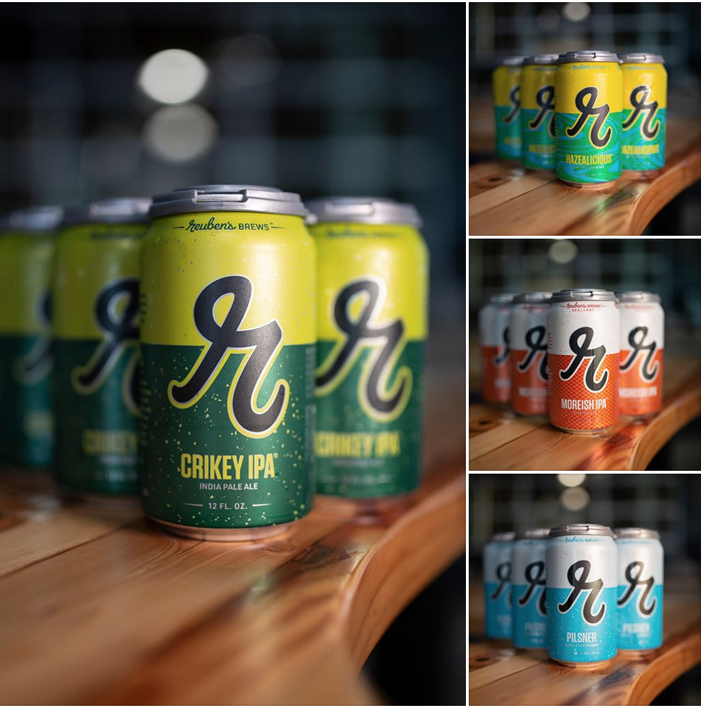
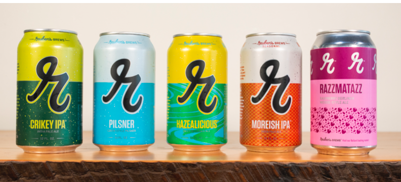
After a handful of various brewery expansions during its seven-year run, Reuben’s Brews now concentrates on its marketing effort as it has refreshed its branding and packaging. This past Saturday the Seattle based brewer hosted its 7th Anniversary and at this time unveiled its new refreshed labels that will soon be seen on its lineup of cans.
“Our family brewery has experienced unbelievable growth over the past seven years,” said Adam Robbings, Co-founder of Reuben’s Brews, in a statement. “We are continuously reinventing our beer lineup, always innovating, always refining. We felt it was time, as we celebrate our seventh anniversary, that our packaging and logo better reflect who we are as a brewery. Our birthday present to the brewery is packaging that is as innovative as the beer inside.”
This new refreshed look still features the lowercase cursive “r” that Reuben’s is well known for. The new packaging and branding is a visual expression of the brewery’s commitment to brewing without constraints, which they call Beer Unbound™. And the first beers that will showcase this new packaging will include cans of Crikey IPA, Pilsner, Hazealicious IPA, Robust Porter, Moreish IPA, and Razzmatazz.

“When we first started, Reuben, our son, was just a baby – and we offered only five beers on tap,” said Grace Robbings, co-founder of Reuben’s Brews, in a statement. “Now our little boy is nearly ten and the brewery has grown alongside him, with two tasting rooms and three breweries in the neighborhood allowing us to pour 36 taps of our own beer. We have also launched a cider named for Reuben’s younger brother, Warren!”
In developing the design work for this refreshed look, Reuben’s Brews hired Pittsburgh-based branding firm Top Hat Design to partner with for the visual evolution.
“An incredibly popular and highly-respected brand like Reuben’s is instantly recognizable to their legions of loyal drinkers,” said Aaron Easler, Creative Director and Partner at Top Hat, in a statement. “As we developed this creative evolution, we knew it was paramount to maintain recognition but usher in a look that visually represents the company’s ‘Beer Unbound’ philosophy. This new look is a solidification of the stake Reuben’s has already claimed – as an instant fixture among the respected breweries in the Pacific Northwest.”
The refreshed packaging can now be found on store shelves. The first beer to feature the new design is the brand-new Moreish IPA, which debuts as a classic seasonal 6-pack across the Pacific Northwest.
